Our world is full of amazing colors! They are very beautiful and very powerful. Colors can affect our moods, our energy levels, and our behavior. They can even determine the way we interact with the world around us. Yet few people are aware of the powerful role that colors play in their own lives.
In this article, we are taking a look at how color psychology can help your branding process and how to choose the right palette for your brand by using Brandician’s unique approach.
What is color psychology?

We all know that certain colors make us feel one way, while other colors make us feel another. The science behind these associations is known as color psychology. Color psychology studies the effect that color has on our emotions, behavior, and psychological processes. If you think about it, you may notice that colors can affect us in many different ways. They have the power to influence our mood, evoke certain memories and stimulate our reactions.
How does it work?

The theory behind color psychology is based on the way we react to different color combinations. Different colors bring different meanings, connotations, and psychological effects that vary from one person to another. Our experiences with colors are shaped by our culture, personal preference, and beliefs. For example, in western cultures, the color red is associated with excitement, danger, urgency, and love. At the same, in Chinese culture red symbolizes luck, joy, happiness, and fertility
The field of color psychology is all about understanding the effects that certain colors have on the human mind. To tackle this question, color psychology uses color theory. The color theory involves the practical application of mixing, matching, and contrasting different colors. It is used to explore concepts like color perception and the effect of color combinations on human mood and behavior.
Research shows that when used correctly, colors can make us feel a variety of feelings which can influence our actions and decisions. That is why color theory became widely popular in the fields of marketing, branding, and design. It is used to create color schemes, and color schemes are used to establish color themes. A good combination of colors can make a world of change to any brand by adding to its personality, speaking out to its customers, and eventually boosting sales.
Basics of the color-theory
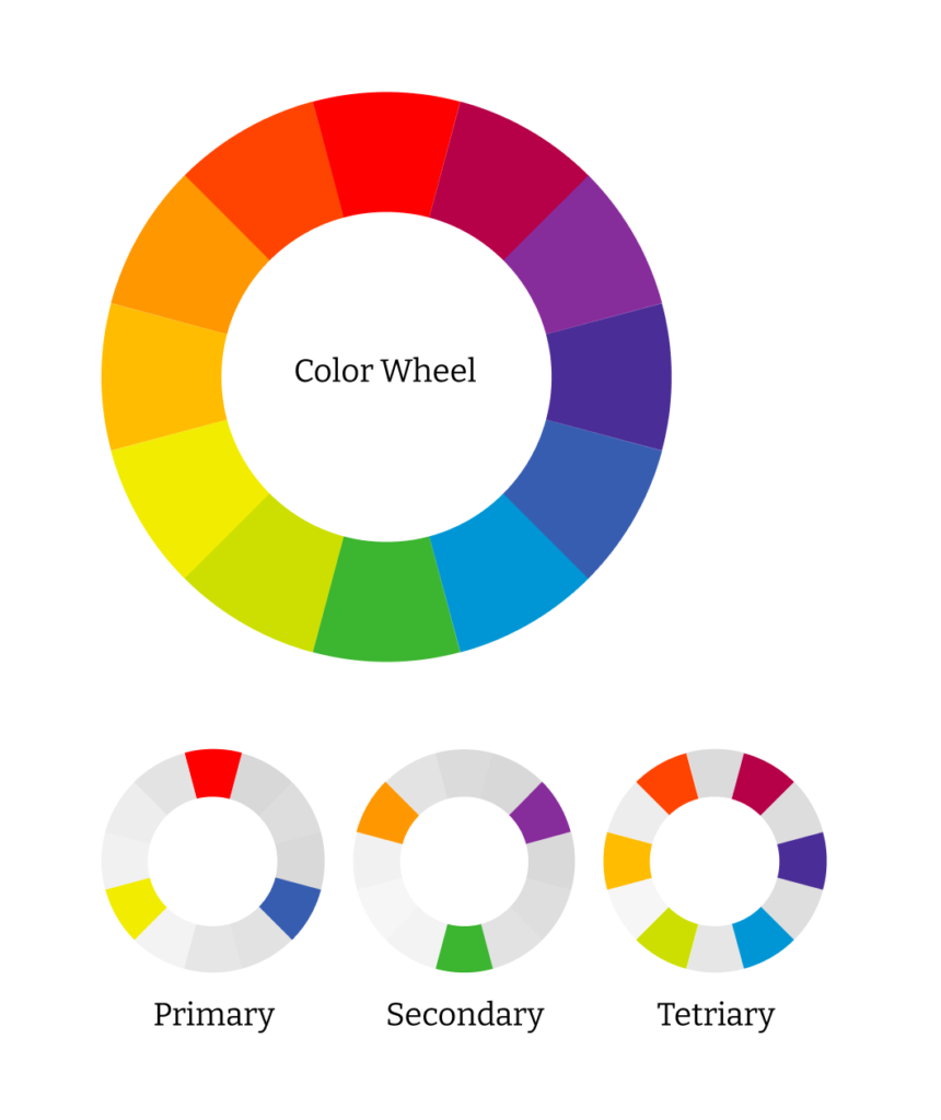
Color theory creates a logical structure for colors and the visual effects of mixing, matching, or contrasting colors with each other. This is the science and art of using color. Colors are organized based on a color wheel which is a visual representation of the color spectrum. Also, it is an excellent tool to help you decide which hues fit together and which ones should be kept apart. Understanding colors can help us create the right atmosphere in a room or communicate a brand’s identity.
Within this theory, colors are grouped into 3 categories: primary colors, secondary colors, and tertiary colors. The primary colors are red, yellow, and blue. These three colors cannot be mixed or formed by any combination of other colors. But rather, they are the starting point from which all other colors are derived. By combining primary colors, you will get green, orange, and purple hues also known as secondary colors. The last category is tertiary colors. Within this category, you can find blue-green, blue-violet, red-orange, red-violet, yellow-orange, and yellow-green. These six colors are the final result of combining primary and secondary colors.
Another thing that should be kept in mind is that color has three basic components. Hue, value, and chroma all play an important role in what we see. Hue literally means color. It can be blue, red or any other shade you can come up with. Value, on the other hand, is the level of brightness. It tells us how light or dark a color is. Lastly, chroma refers to the level of saturation or intensity of the color. Hues with a low chroma look pale, while those with a high chroma look vivid. Depending on the levels and combinations of these, every color has many shades: From light to dark or pale to vivid. Every possible combination of those components gives a new shade and every shade can have a unique impact on you.

Color psychology in branding
Let’s take a moment to think about McDonald’s. Did their red and yellow brand colors pop up in your mind? That is because McDonald’s successfully used brand color psychology to create a strong association in their customers’ minds. When used correctly colors can be a powerful tool that can boost your business and add to your brand personality.
Your brand colors can create a strong association, or they can inspire certain feelings, thoughts, and desires. The right combination of colors can evoke a sense of calm and peace, or excitement and adventure. That is why, in most cases, businesses use color psychology in marketing, branding, and advertising.

Why is it important?
Branding is all about creating powerful associations in your target customer’s mind, and your brand colors help you do just that. A carefully chosen color palette can add to your brand identity and brand recognition. It conveys the meaning and has an active role in communicating with your target customers. This is why you should put some time into creating a color palette that tells your story and speaks to your customers.
An understanding of color psychology can help you shape the perceptions that drive consumer behavior. For example, did you ever notice that “purchase this” buttons are almost always red? This is because the color red is associated with a call for action. Red is known to be bold. It correlates with passion, drive, and excitement. It is also good at catching attention. A HubSpot research shows that button color has a big effect on the overall conversion of the page. Evidently, the red button outperformed the green button by 21%. That is a 21% increase in the conversion and a clear indicator that color plays an important role in decision making.
This study was only about the button. Now, imagine what you can achieve if you fully harmonize your brand colors with your brand personality and your target audience. Choosing the right colors can help you communicate your values and brand story authentically. It makes you memorable and connects you with your audience on a subconscious level.
Common mistakes in choosing the brand color
Your brand identity is a crucial part of your business. However, choosing the color for your brand can get a little tricky. One of the most common mistakes is choosing your brand color just because you like it. Your preferences are important, and they should be considered when creating a color palette for your brand. But there are a couple of other things that should be taken into account as well.
For example, you should consider how well your brand color resonates with your target customers, what colors do your competitors use, and how you will use your colors. Failing to consider these aspects is a common mistake in choosing the brand color. On the other hand, knowing this information can help you choose colors that show your uniqueness and differentiate you from the other offers on the market.
All of these mistakes are directly connected with not using color psychology. The fact is that every color on the color wheel has a unique meaning. It evokes thoughts and emotions, both consciously or subconsciously. Within this article, we have already mentioned a couple of reasons why color psychology is super-useful.
It helps your brand identity and brand recognition by conveying meaning and communicating them to your target customers.
All those reasons are exactly why you should consider color psychology when choosing your brand color.
How to choose the right palette for your brand using Brandician’s unique approach
At Brandician we understand and stress the importance of color. So much so that we even created our unique approach for choosing the right colors for our customers. We start with an interpretation of your brand personality by using classic color psychology. Then we use the archetypal personality crosscheck with Thoth Tarot. This process allows us to create your brand colors while keeping in mind the possible subconscious interpretations and avoiding negative associations.
Let’s take a look at what makes us unique and our method one-of-a-kind:

1. We observe
Your colors should be authentic to you. They should also speak to your customers and make you stand out from your competitors. That is why our first step when creating the main brand color for our customers is to observe. We start by observing what colors existing brands use and why they use them. We are also interested in colors that other stakeholders are keen on and the colors that our customers use in their everyday life.

2. We use the color interpretation of the brand personality
We always make sure to check the classic color interpretation of brand personality traits. This means using color psychology to align your brand personality with what your brand colors are communicating. For example, if you are a practical, down-to-earth brand we might suggest you use the color green. But if you want to communicate how dependable and trustworthy you are blue could be the color you should opt for.
3. We consider archetypal colors
Alongside color psychology, our method always considers archetypal symbolism. Brand archetypes convey deep meanings which make them especially powerful for a successful branding process. The archetypal representations of color are used to communicate a message or underscore a theme. Connecting your brand archetype with an adequate color creates a visual identity that speaks to your customers and affects their decision-making process. The archetypal color wheel is a great tool for doing just that. It shows positive and negative interpretations that your brand colors might carry. Knowing this information helps us build strategic meanings that speak to your customers’ desires and motivation.
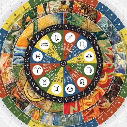
4. We use Thoth Tarot and Astrology in branding
Thoth Tarot deck is a stunning deck full of symbolism and striking imagery. It is full of unique designs and includes color systems from Kabbalah’s Tree of Life and Astrology.
Thoth Tarot is based on the collective unconscious theory and the meaningful repetition of archetypal images and themes across different cultures. In addition to this, Thoth Tarot uses colors as a means to convey meaning. For example, the color orange represents drive, activity, ambition, enthusiasm, warmth, and sociability.
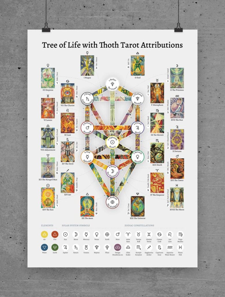
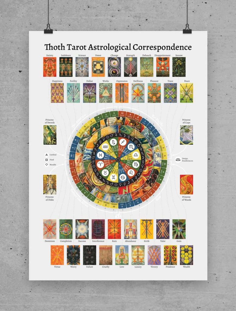

To align our customers’ brand colors with their brand archetype, personality traits, values, astrology, and Tarot we use our specially designed posters for tarot studies and meditation. This process helps us understand what psychological and unconscious associations may arise from the brand color interpretation.

5. We create a color palette
After cross checking your brand colors with color psychology, archetypal colors, Thoth Tarot, and Astrology we are ready to create a color palette that will suit your brand perfectly. By balancing the hue, value, and chroma of individual colors and applying contrast between them we create your brand color palette.
Summing it up
Your brand colors are a key to your visual identity and a successful branding process. Color psychology, tarot, and astrology all teach us that different colors bring different meanings, connotations, and psychological effects. For this reason, choosing the right color for your brand can add to your brand identity, recognition and even boost up your sales.
Brandician developed a unique approach for choosing the right brand colors. It uses color psychology, Thoth tarot, and astrology to help customers’ branding process. We are the only branding company that uses this method! With our customer-centric approach, active use of psychology, and emotion-inducing design we create brands that make you and your customers feel great.
We have helped many brands find the right colors to tell their stories. If you need help creating your brand colors just contact us and we will get started.